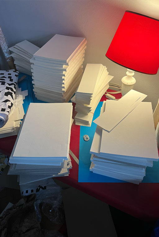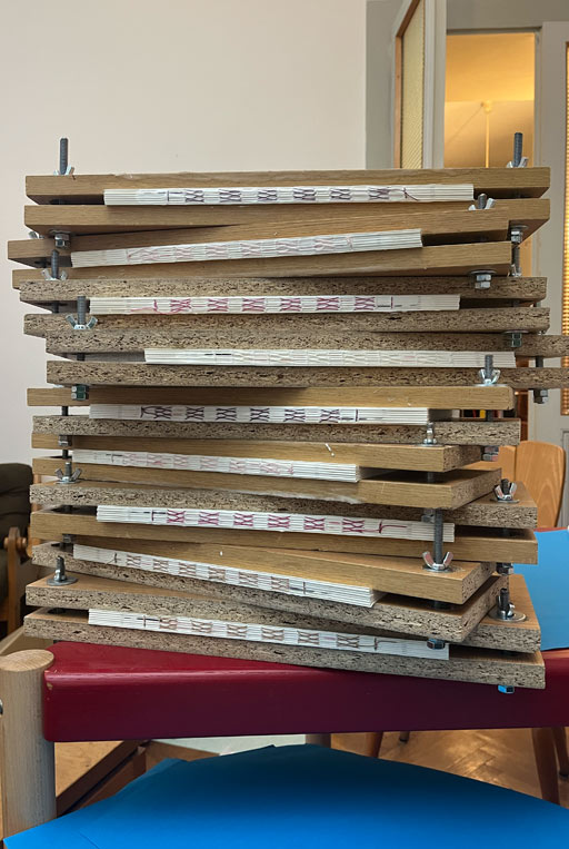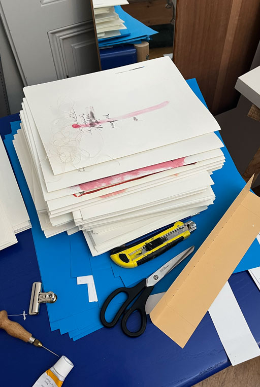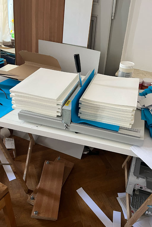
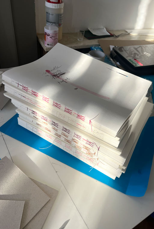
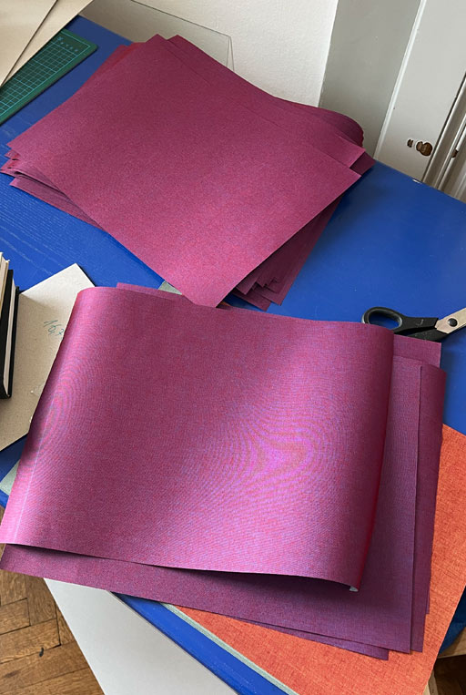
The Amsterdam-based artist and painter Charlott Weise, commissioned me to design her first publication called Schade um jeden Kuss. The project involved not only the concept and design of the book but also the craftsmanship, including manually binding 66 copies over a period of approximately three months. Each copy was carefully crafted from folding and stitching to thread binding and gluing, and even the color-shifting linen covers were adorned using screen printing.
Despite the immense workload and potentially high costs compared to a conventional project, my main goal was to create a high-quality object that could stand next to Charlott’s impressive and beautiful drawings. With its 96 pages the hardcover book is definitely a work of art in itself. It was launched during Milano Art Fair and can be purchased through the artist or through her gallery, Belmacz, in London.
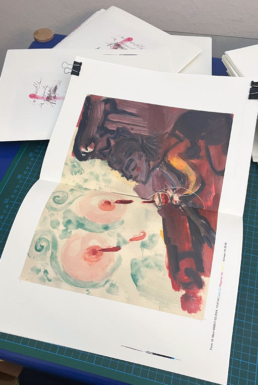
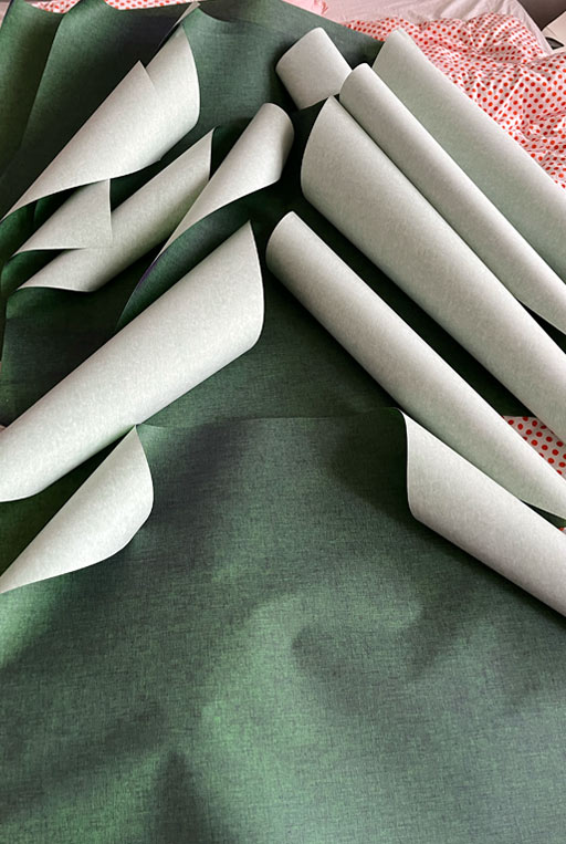
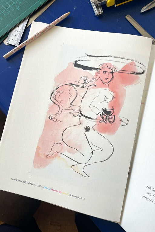
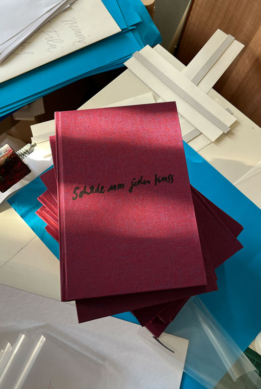
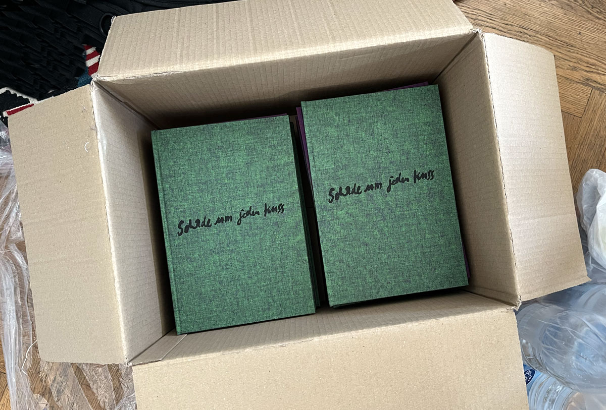
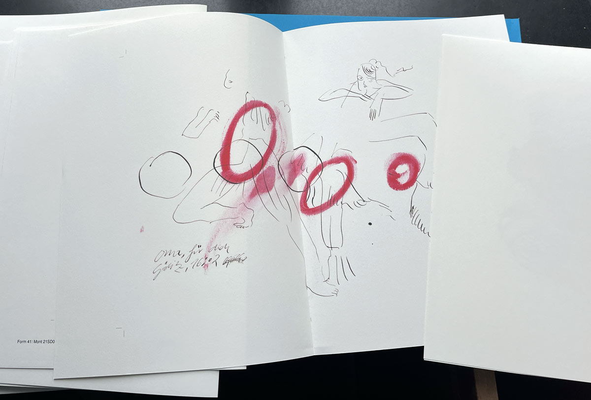
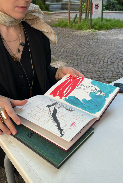
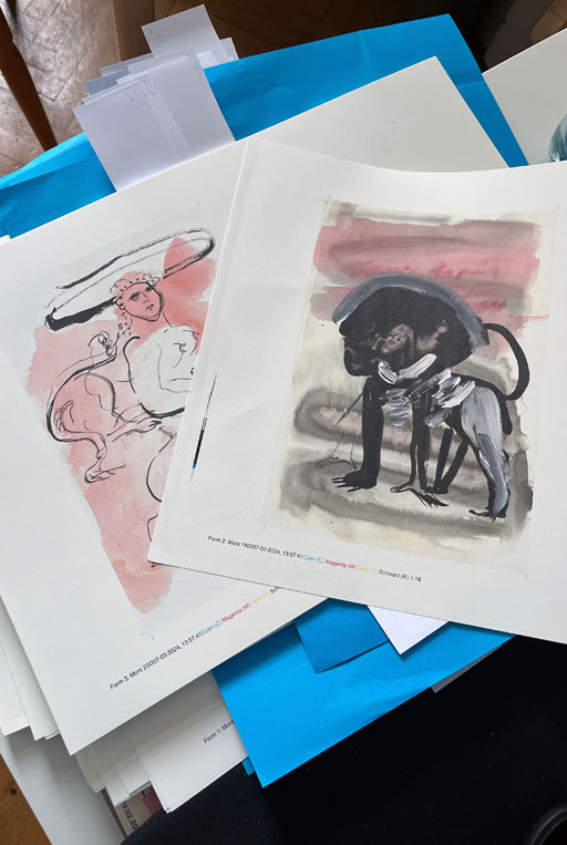
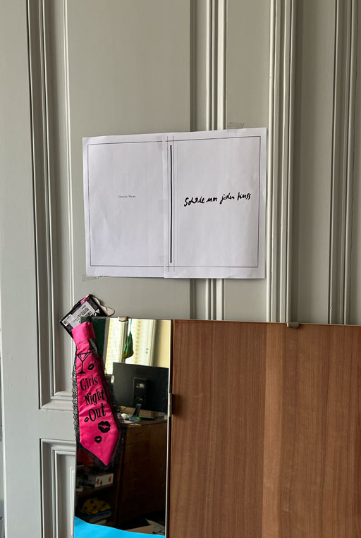
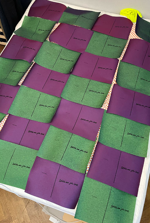
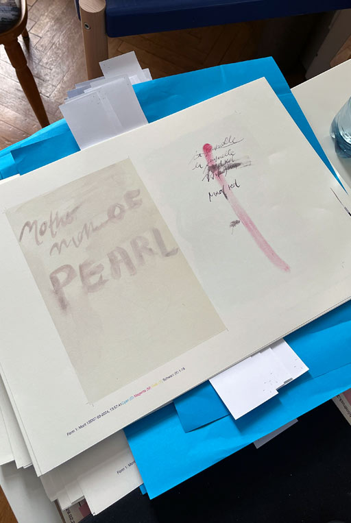
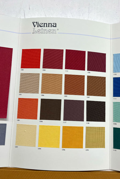
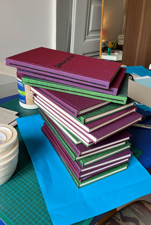
After Charlott initially sent me a multitude of her works, the first task was to make a coherent selection. The book is meant to evoke the feeling of one of her sketchbooks. Printed on rough paper with an indigo machine, there is no linear sequence of images. Additionally, completely empty spreads are meant to keep the drama of flipping through the pages lively. The imprint was subsequently applied with a double-grip stamp. For the hardcover, two differently colored linens were used. Both having a shifting effect: green-violet and red-violet. As a result, the book changes its appearance with every lighting condition.


The Amsterdam-based artist and painter Charlott Weise, commissioned me to design her first publication called Schade um jeden Kuss. The project involved not only the concept and design of the book but also the craftsmanship, including manually binding 66 copies over a period of approximately three months. Each copy was carefully crafted from folding and stitching to thread binding and gluing, and even the color-shifting linen covers were adorned using screen printing.
Despite the immense workload and potentially high costs compared to a conventional project, my main goal was to create a high-quality object that could stand next to Charlott’s impressive and beautiful drawings. With its 96 pages the hardcover book is definitely a work of art in itself. It was launched during Milano Art Fair and can be purchased through the artist or through her gallery, Belmacz, in London.


After Charlott initially sent me a multitude of her works, the first task was to make a coherent selection. The book is meant to evoke the feeling of one of her sketchbooks. Printed on rough paper with an indigo machine, there is no linear sequence of images. Additionally, completely empty spreads are meant to keep the drama of flipping through the pages lively. The imprint was subsequently applied with a double-grip stamp. For the hardcover, two differently colored linens were used. Both having a shifting effect: green-violet and red-violet. As a result, the book changes its appearance with every lighting condition.
