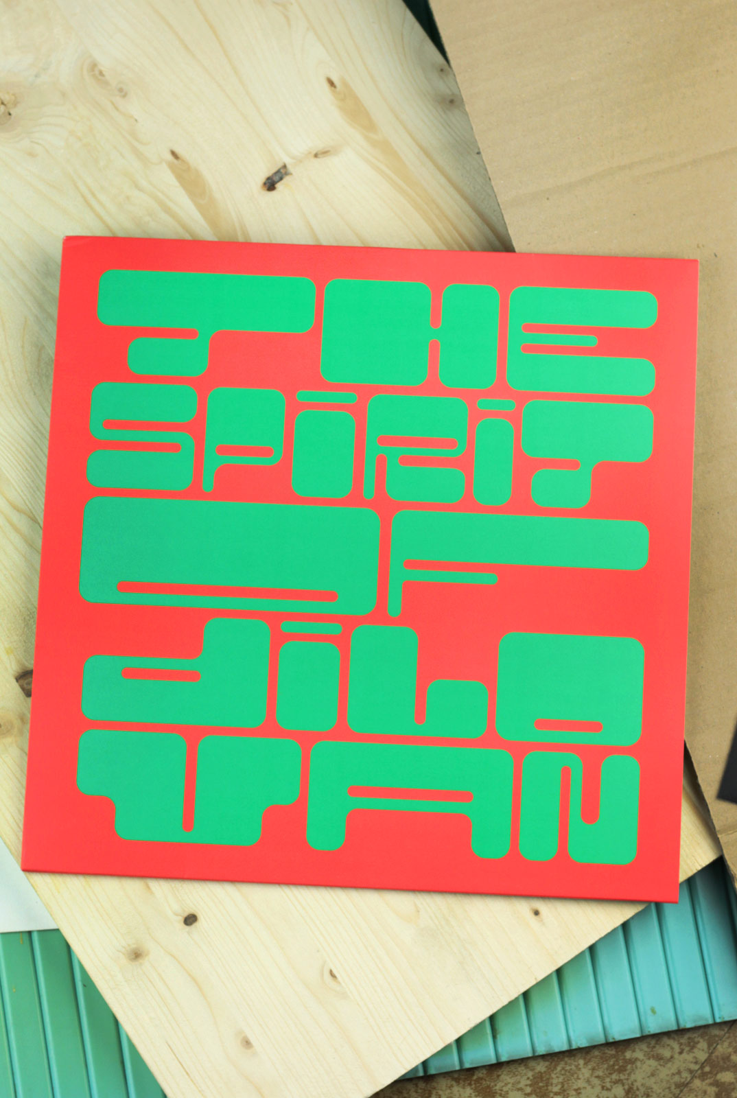

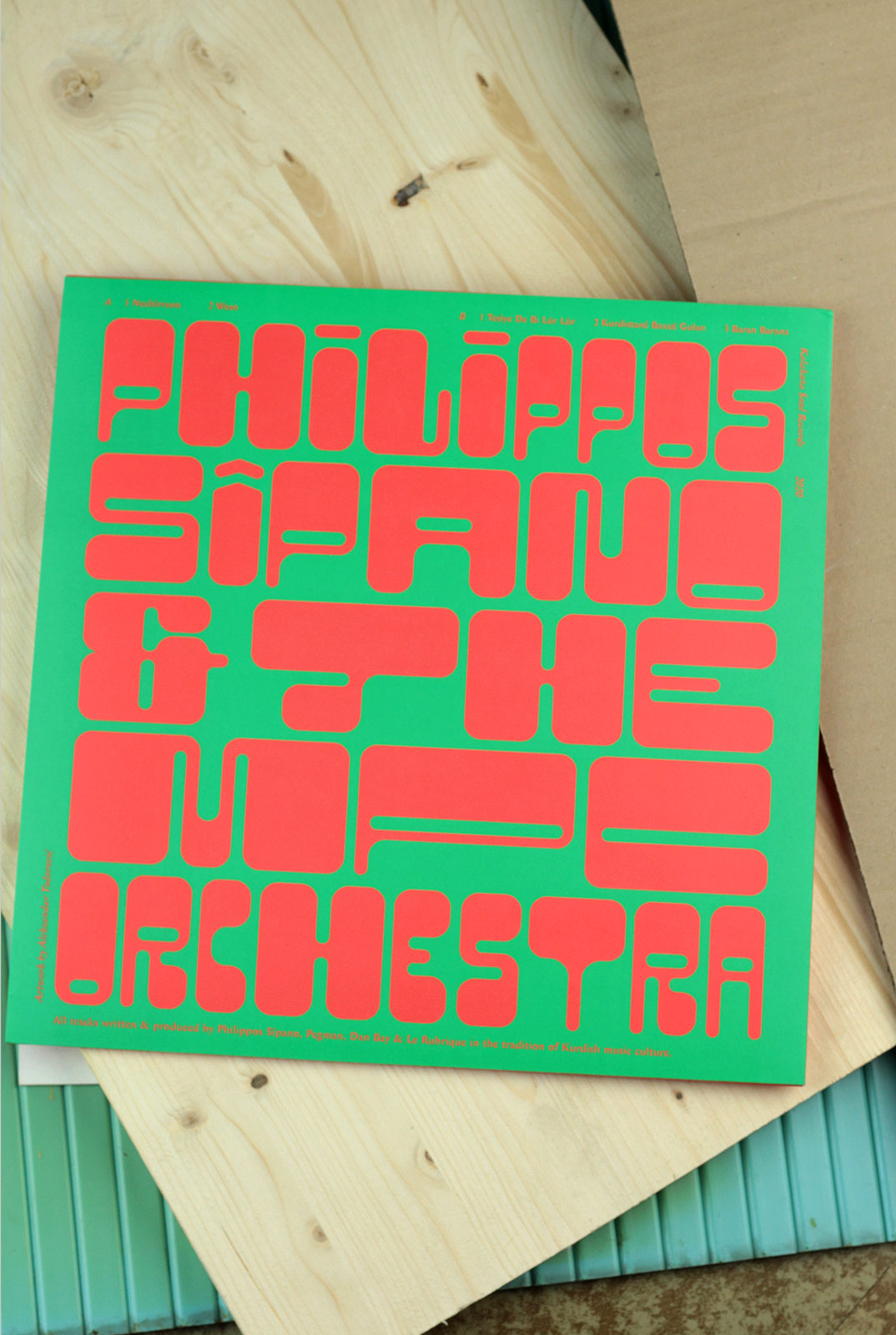
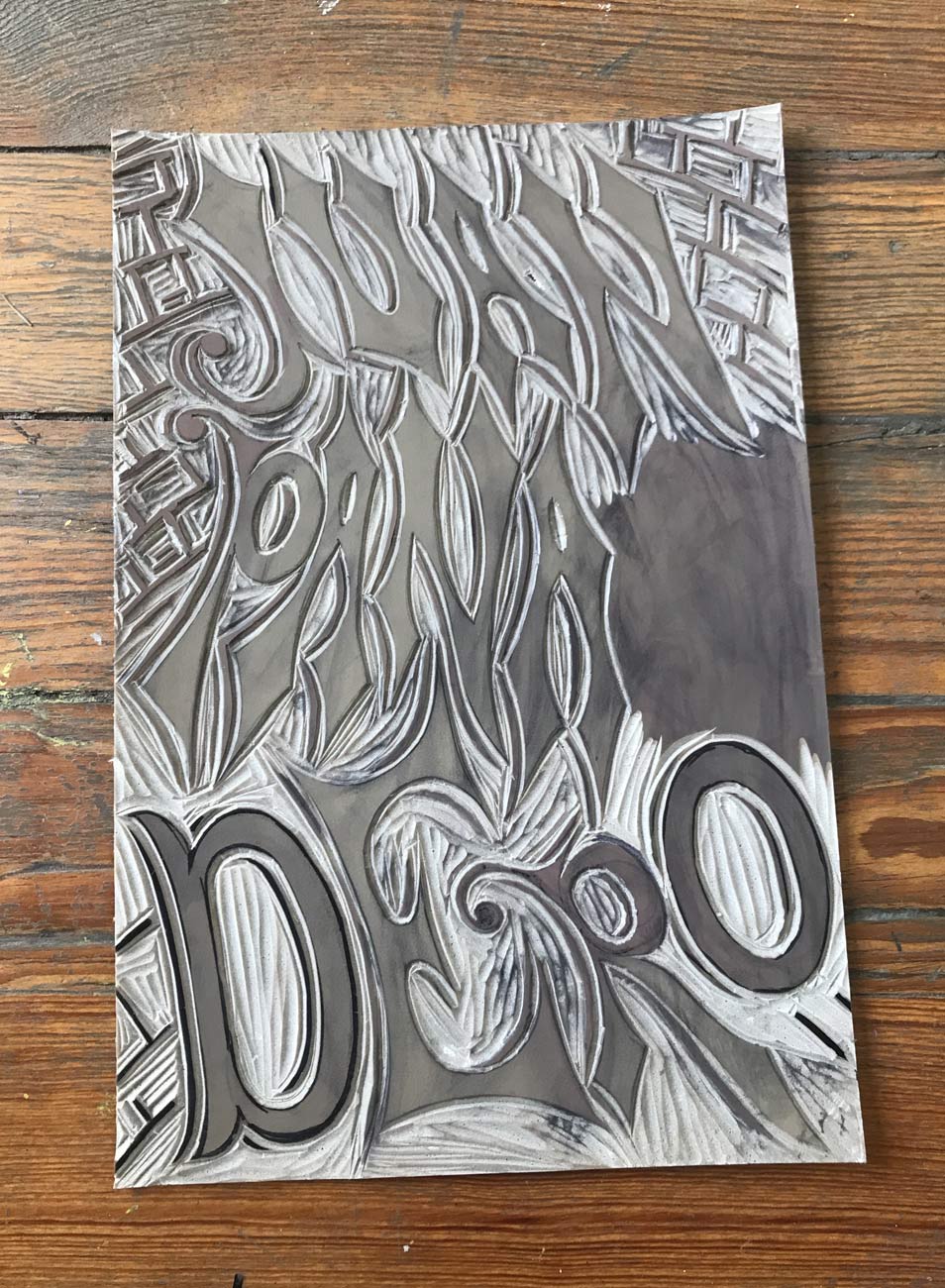
In summer 2020 I was commissioned by the Bochum-based record label Kalakuta Records to design a record sleeve for the Kurdish musician Philipos Sipano and the MPC Orchestra. For the cover I created a custom font inspired by my trip to Mexico some months before.
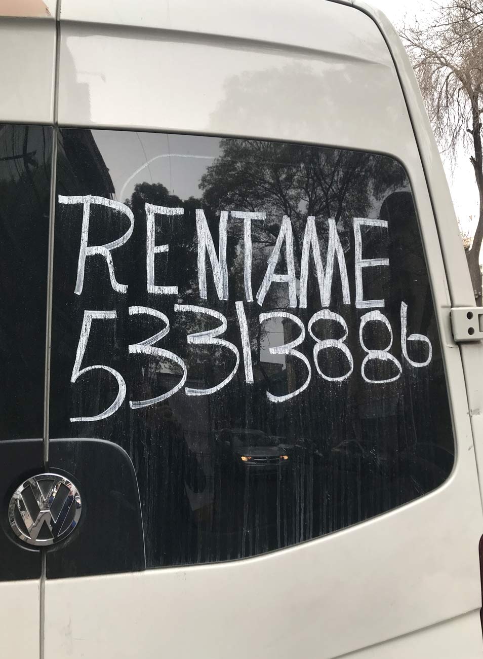
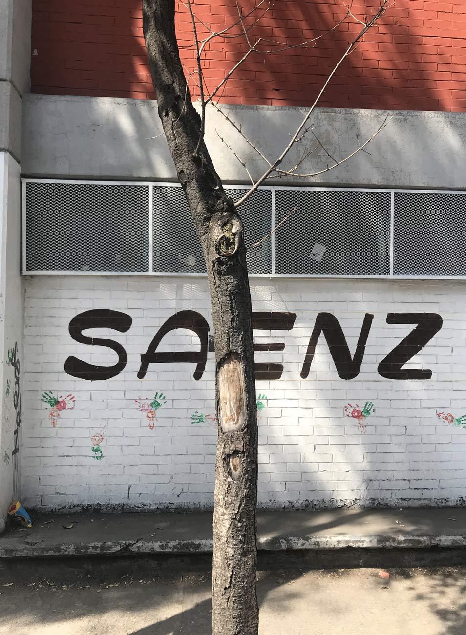
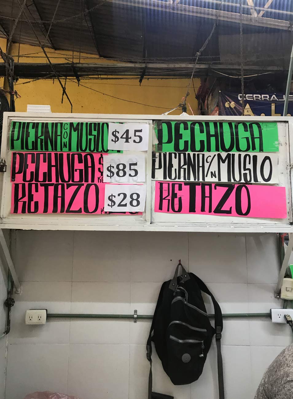
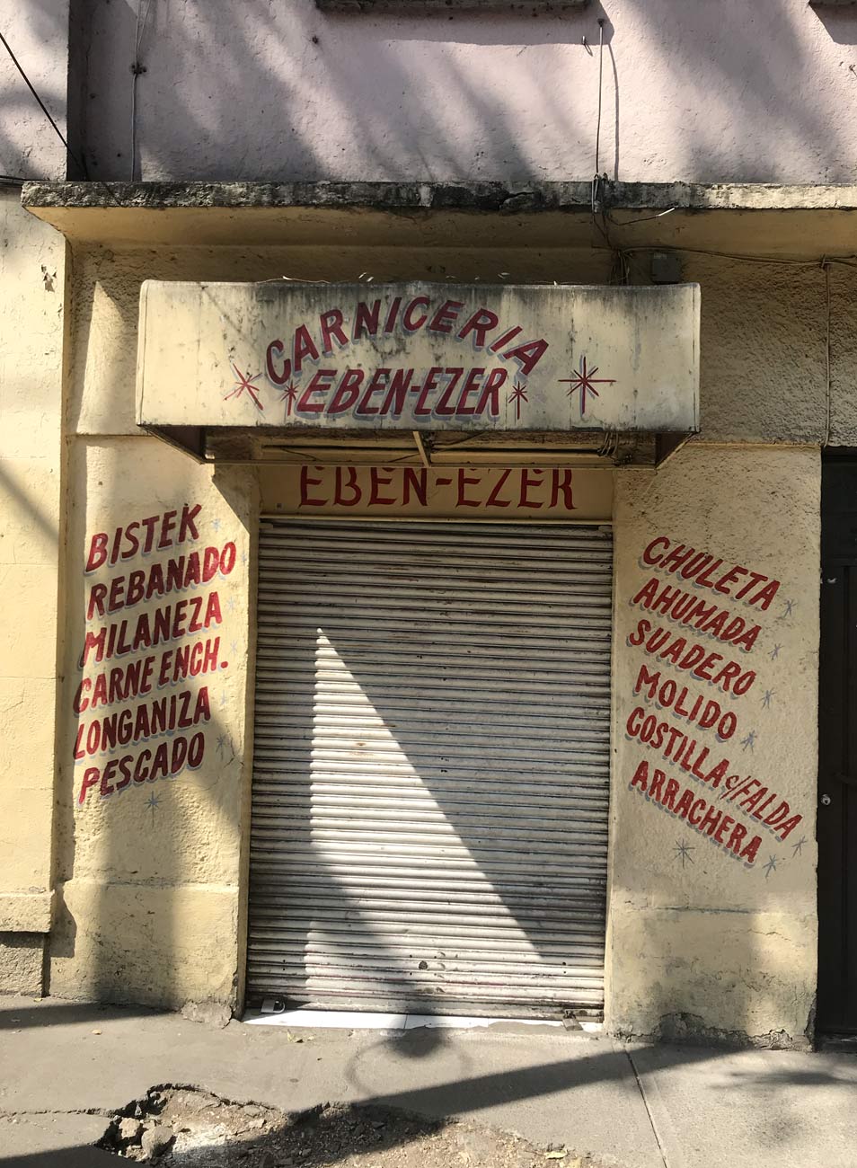
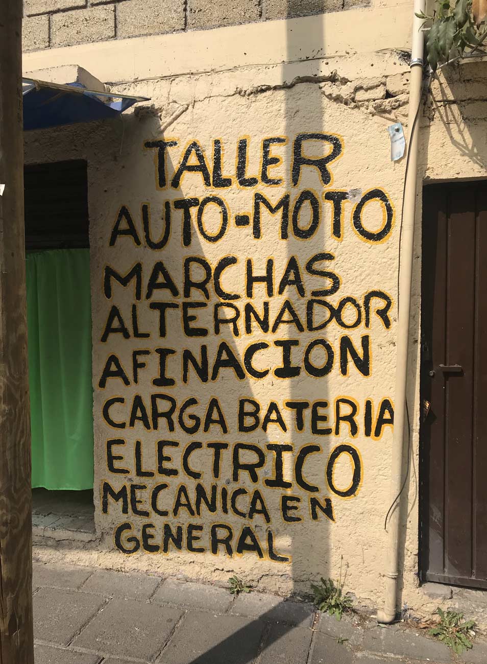
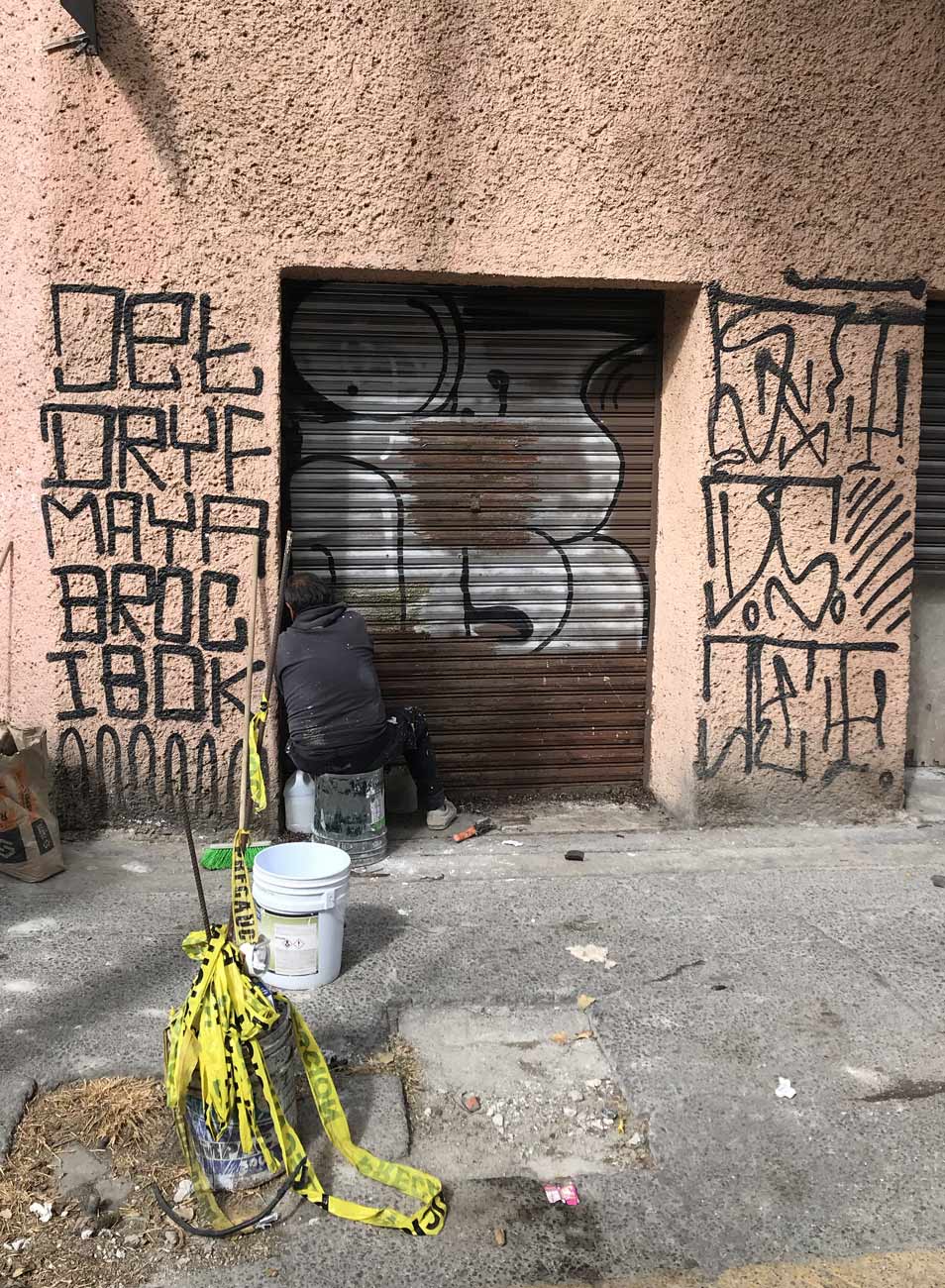
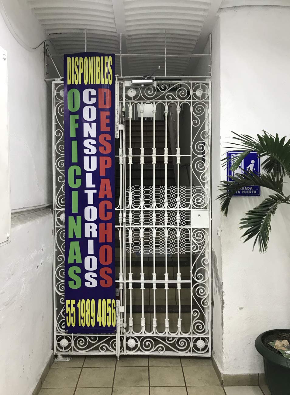
I spent the winter of 2020 in Mexico City from where I could continue my work and to be inspired by a completely new environment. I noticed very quickly that Mexico is a very typographic affine country. Maybe not on a professional and sophisticated level like Holland or Switzerland, but an awareness of typography is definitely there among Mexicans. Be it printed posters or handwritten walls with commercials, the cityscape is definitely characterized by writing.
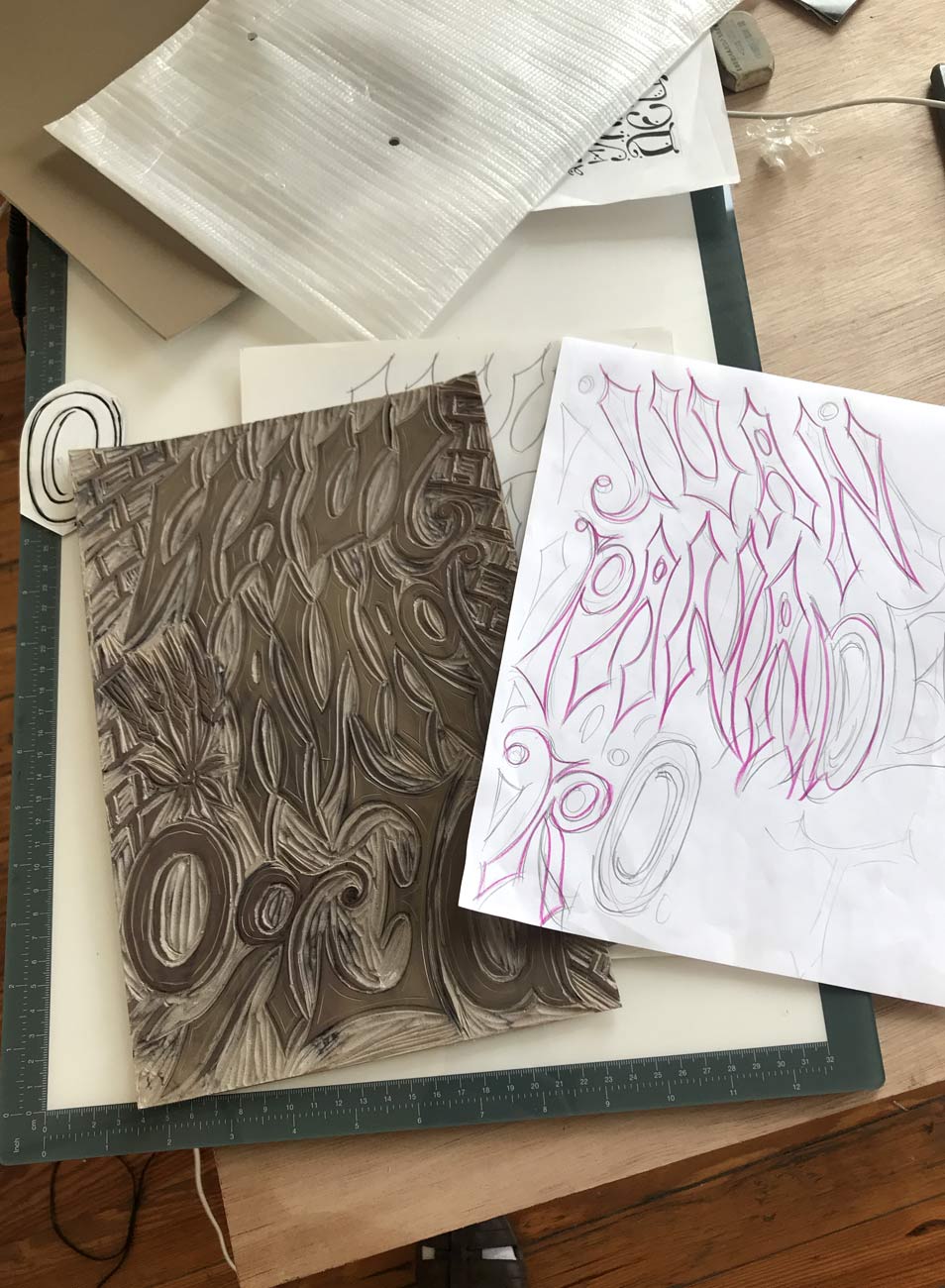
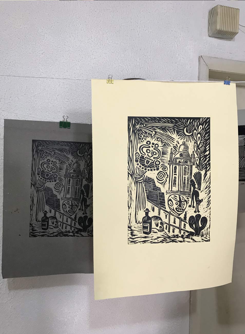
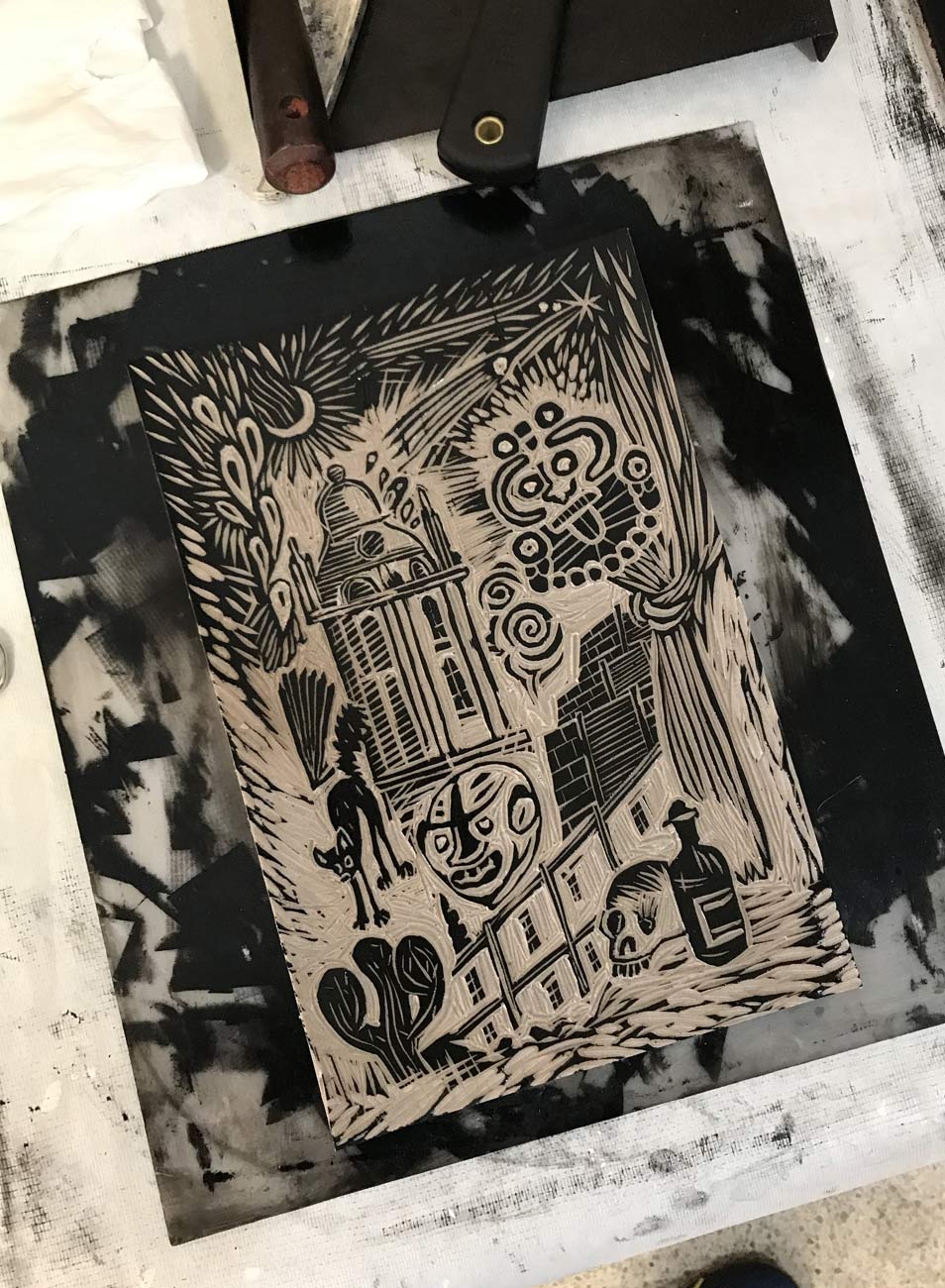
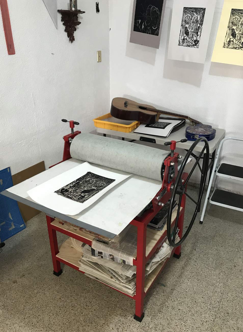
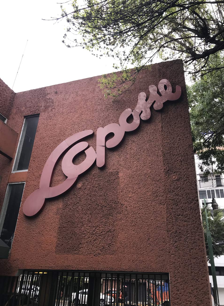
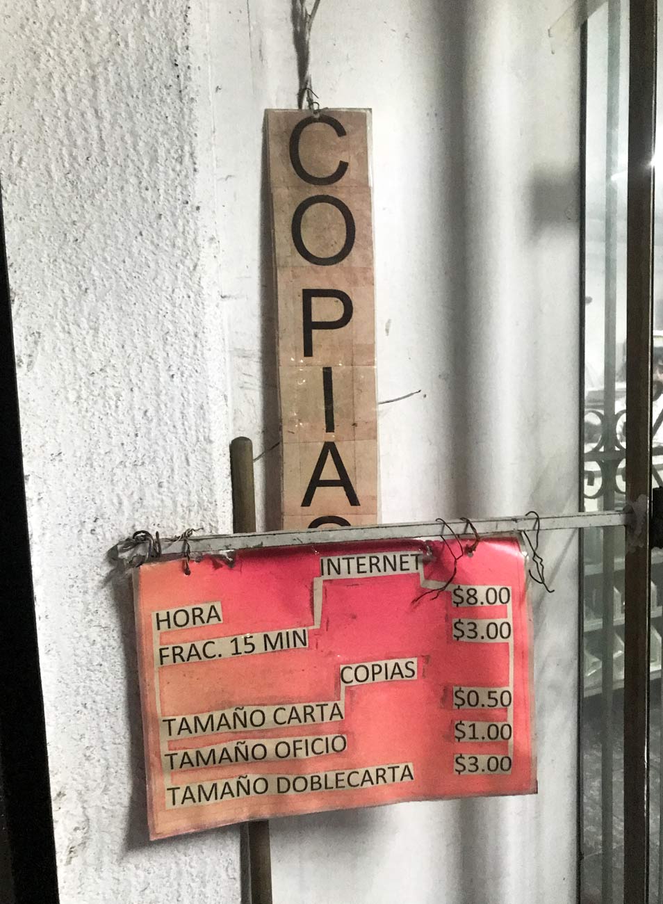
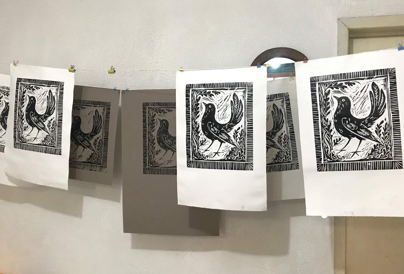
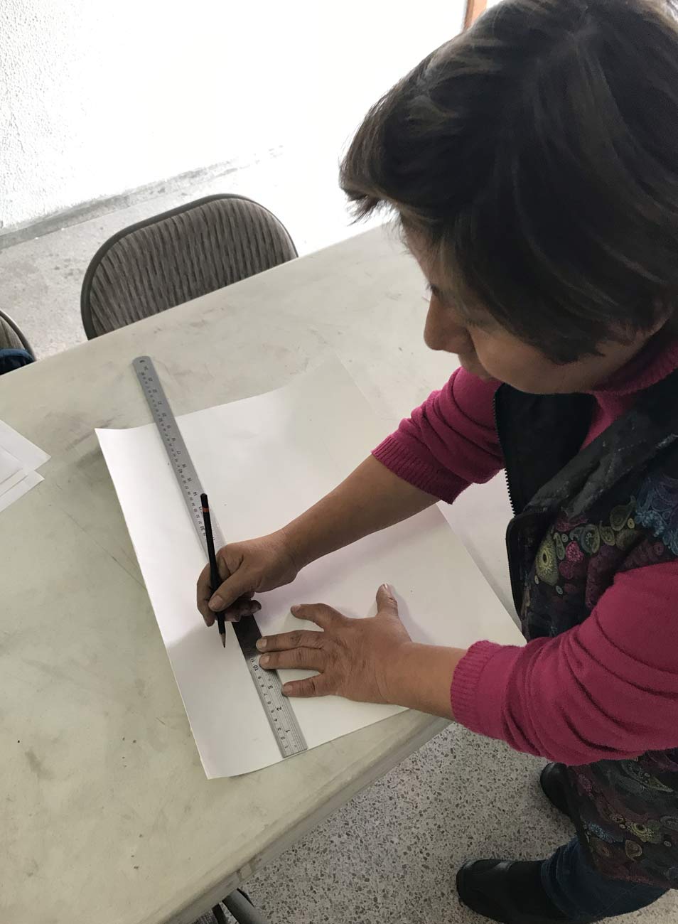
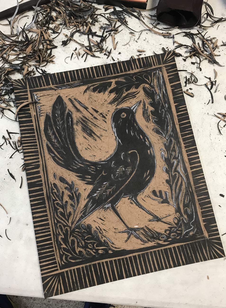
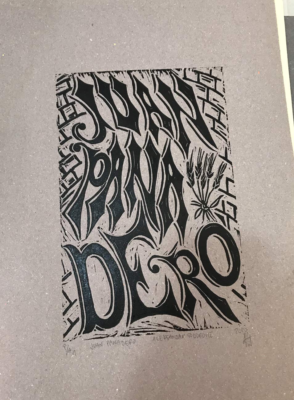
So, while strolling through the streets of México City, I came across Veronica’s small lynography workshop, an elderly lady who offers various courses for the neighborhood. It was immediately clear to me that I’m going to attend her courses. Although they were open to everyone, it was basically just her and me every week.
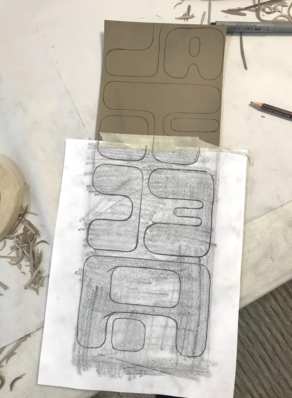
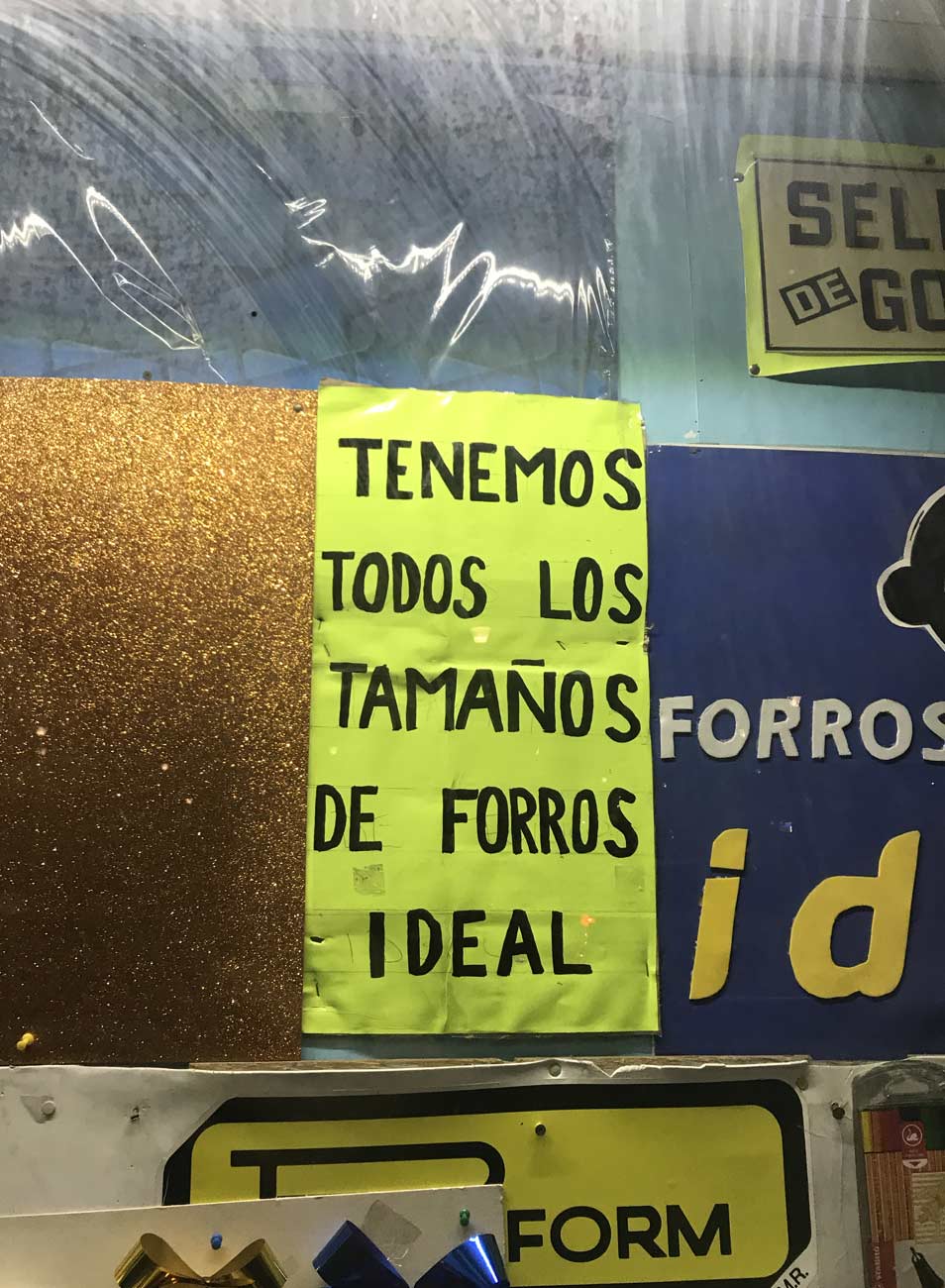
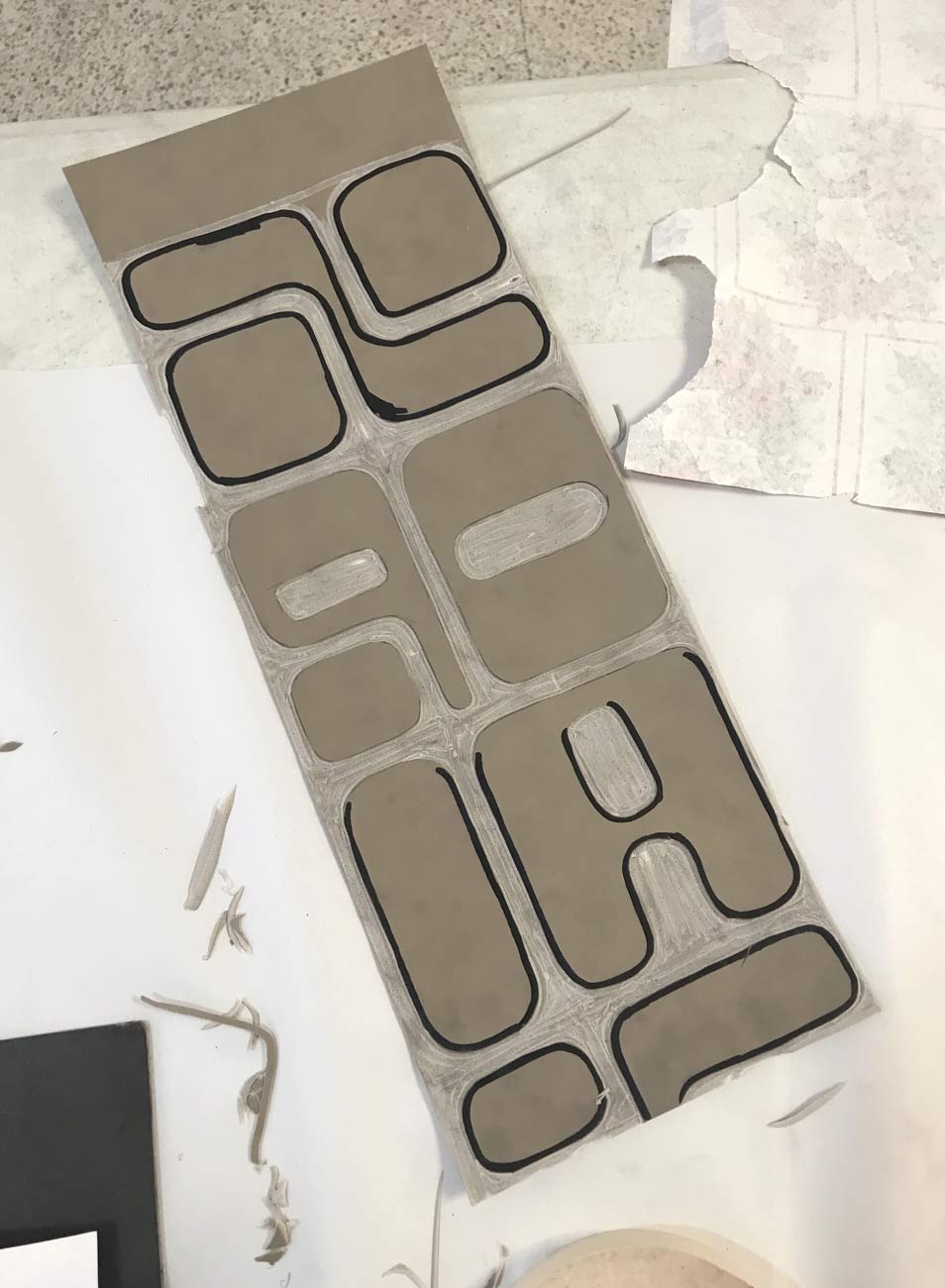
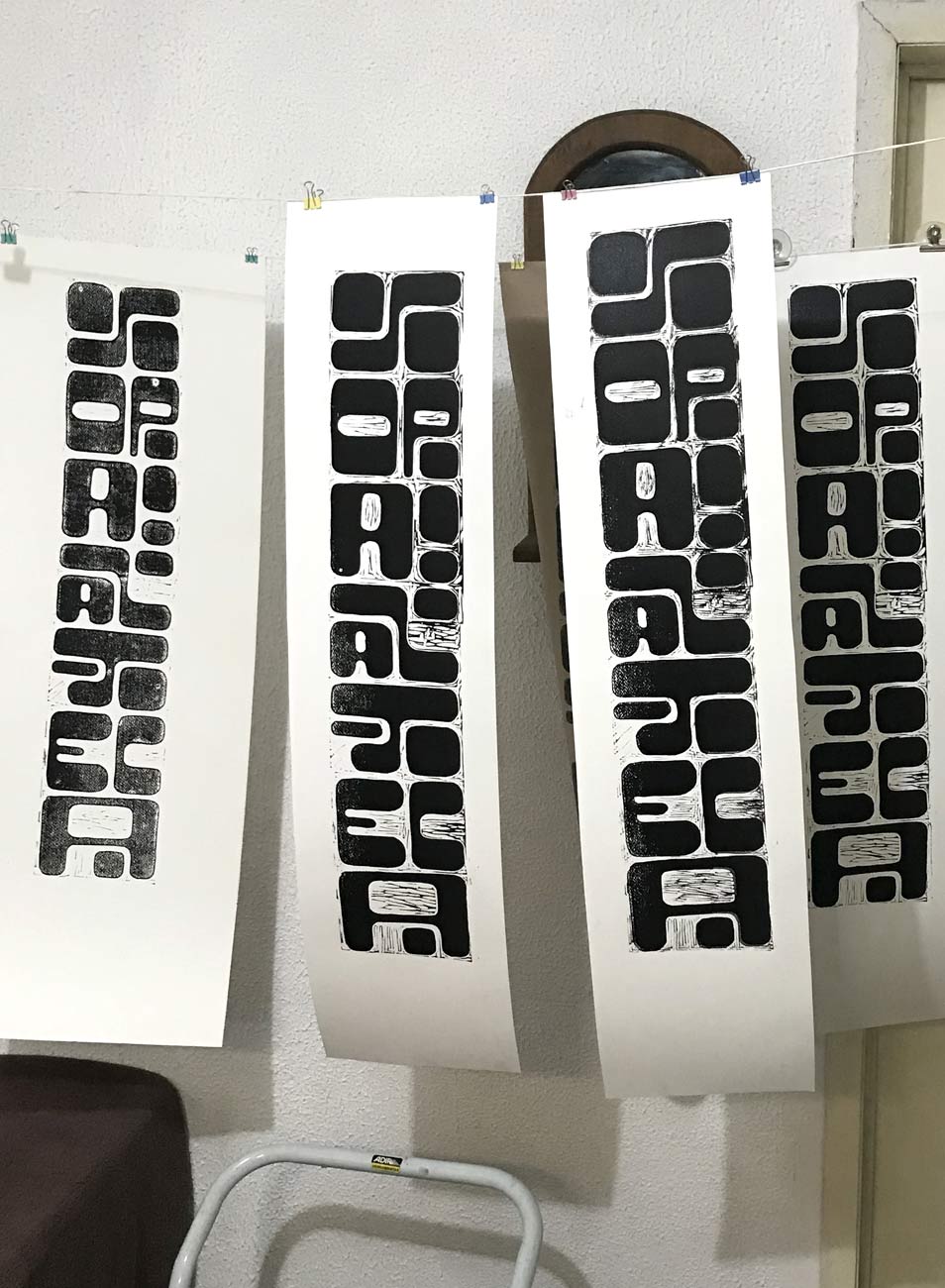
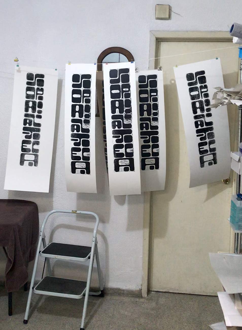
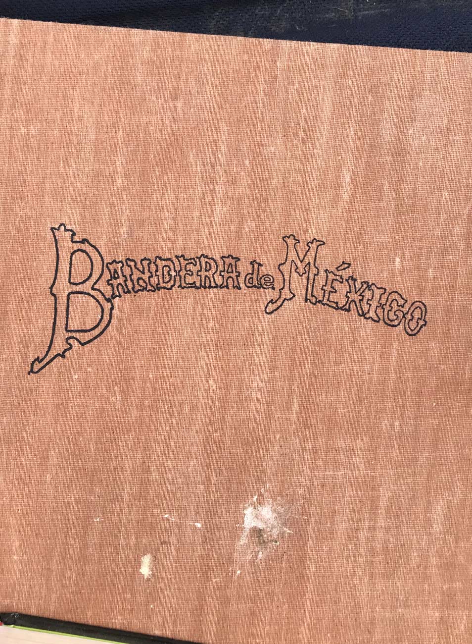
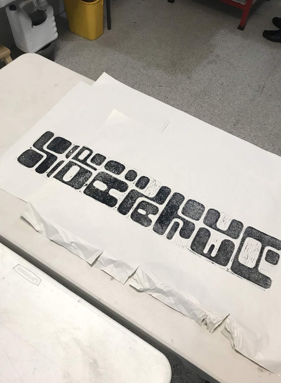
Every week she gave me a book to use as inspiration for my motifs. One of them was a collection of José Guadalupe Posada’s illustrations, Mexican artist famous for his morbide, typical Mexican wood engravings. Inspired by the shapes and colors of the Mexican cities but also of the ancient Meso-American cultures, I created the amorphous font SOPA AZTECA.



It often happens that I develop a font or a design for which there is initially no reason, because I don't want to make my creativity dependent or impaired on it. Sooner or later the opportunity arises to implement the font or the design in a work anyway, as the example of the record sleeve also shows.





In summer 2020 I was commissioned by the Bochum-based record label Kalakuta Records to design a record sleeve for the Kurdish musician Philipos Sipano and the MPC Orchestra. For the cover I created a custom font inspired by my trip to Mexico some months before.
I spent the winter of 2020 in Mexico City from where I could continue my work and to be inspired by a completely new environment. I noticed very quickly that Mexico is a very typographic affine country. Maybe not on a professional and sophisticated level like Holland or Switzerland, but an awareness of typography is definitely there among Mexicans. Be it printed posters or handwritten walls with commercials, the cityscape is definitely characterized by writing.
So, while strolling through the streets of México City, I came across Veronica’s small lynography workshop, an elderly lady who offers various courses for the neighborhood. It was immediately clear to me that I’m going to attend her courses. Although they were open to everyone, it was basically just her and me every week.


Every week she gave me a book to use as inspiration for my motifs. One of them was a collection of José Guadalupe Posada’s illustrations, Mexican artist famous for his morbide, typical Mexican wood engravings. Inspired by the shapes and colors of the Mexican cities but also of the ancient Meso-American cultures, I created the amorphous font SOPA AZTECA.
It often happens that I develop a font or a design for which there is initially no reason, because I don't want to make my creativity dependent or impaired on it. Sooner or later the opportunity arises to implement the font or the design in a work anyway, as the example of the record sleeve also shows.
